5 REASONS YOUR WEBSITE ISN’T CONVERTING VISITORS INTO CUSTOMERS
You’re getting traffic. Google Analytics shows real numbers, ads are driving clicks, maybe you’re even ranking organically for the terms that matter. And yet the phone isn’t ringing and the contact form sits empty. That gap between “people are visiting” and “people are buying” has a name: it’s a website conversion optimization problem, and it’s one of the most common — and most fixable — issues small business sites run into.
A conversion happens any time a visitor completes the action you actually want: filling out a contact form, requesting a quote, calling your number, or completing a purchase. Your conversion rate is simply conversions divided by total visitors. If 200 people visit your site this month and 4 of them contact you, you’re converting at 2%. Whether that’s good, bad, or somewhere in between depends on more than gut feeling — and on five specific, diagnosable problems most underperforming sites share.
What Counts As A Good Website Conversion Rate?
The blended average website conversion rate across all industries sits at roughly 2-3%, based on WordStream’s analysis of large-scale conversion data — but that number hides a wide spread [1]. The top 25% of sites convert at 5.31% or better, and the top 10% clear 11.45% [1]. That’s a 5x gap between an “average” site and a genuinely good one, using the exact same traffic.
That spread matters because it tells you something important: a low conversion rate usually isn’t a traffic problem. It’s usually one (or several) of the five reasons below — all fixable without spending another dollar on ads.
Reason 1: Visitors Don’t Understand What You Do Within 5 Seconds
Most homepages fail what’s sometimes called the five-second test: can a total stranger land on your page and, within five seconds, tell what you do, who it’s for, and why they should pick you over the next search result? If the answer requires scrolling, squinting, or decoding buzzwords like “innovative solutions” or “excellence since 1995,” visitors won’t stick around to find out.
Vague Headlines Cost You Leads
Compare “Excellence in Plumbing Services Since 1995” to “Emergency Plumber in Denver — We Fix Your Plumbing Problem in 60 Minutes.” The second headline answers three questions instantly: what you do, where you serve, and why it matters right now. The first says nothing a visitor can act on.
The Fix Is Specificity, Not Redesign
You don’t need a full rebrand to fix this — you need your hero section to name the service, the audience, and the outcome in plain language. Cut industry jargon, cut “we believe” mission statements above the fold, and lead with the thing your customer actually searched for.
Reason 2: Your Website Loads Too Slowly
Speed isn’t a technical nice-to-have — it’s a conversion mechanism. Google’s own mobile research found that 53% of mobile site visits are abandoned if a page takes longer than three seconds to load [2]. And speed doesn’t just cost you visitors who never see your content — it costs you conversions from the ones who stay. A widely-cited Aberdeen Group study found that a 1-second delay in page load time correlates with an 11% drop in page views, a 16% decrease in customer satisfaction, and a 7% loss in conversions [3].
What Usually Makes A Site Slow
The most common culprits are oversized, uncompressed images, bloated page-builder code, too many third-party scripts and plugins, and cheap shared hosting. Each one is independently fixable, but they tend to stack — a site built on a heavy page-builder plugin with a dozen add-ons is fighting speed problems on multiple fronts at once.
Quick Wins Worth Testing Today
Run your homepage through Google PageSpeed Insights right now. If your Largest Contentful Paint (a Core Web Vitals metric measuring how fast your main content appears) is above 2.5 seconds, that’s a direct, measurable predictor of visitors leaving before they see your offer.
Reason 3: Your Calls To Action Are Weak, Hidden, Or Competing
A visitor who’s interested but doesn’t know what to do next won’t convert — they’ll just leave. Many small business sites accidentally sabotage themselves here by offering five buttons (“Call Now,” “Get a Quote,” “Schedule a Consultation,” “Download a Guide,” “Sign Up for Our Newsletter”) with no clear hierarchy, forcing the visitor to make a decision they didn’t come to make.
One Page, One Primary Action
Every page should have exactly one dominant conversion goal. Everything else — secondary links, newsletter signups, social follows — should visually take a back seat. When someone is ready to act, they shouldn’t have to think about which button matters.
Make It Impossible To Miss
Use a contrasting button color, action-oriented copy (“Get Your Free Quote” beats “Submit”), and place your primary CTA above the fold, mid-page, and again at the end of the content. Different visitors decide to act at different points in the page — give all of them a chance.
Reason 4: Visitors Don’t Trust You Yet
A stranger’s default reaction to a new website is skepticism, not interest. Before someone will pick up the phone or fill out a form, they need evidence that you’re legitimate and that other people have had a good experience with you.
The Trust Signals That Actually Move The Needle
Reviews, testimonials with real names, before-and-after photos, licenses and certifications, and specific guarantees all reduce hesitation — but only if they’re visible without scrolling deep into the page. A five-star rating with “200+ verified reviews” placed near your CTA does more work than the same rating buried in a footer.
Vague Guarantees Don’t Count
“100% satisfaction guaranteed” is filler. “If we don’t fix your problem, you don’t pay — guaranteed” is a specific, concrete promise a hesitant visitor can actually evaluate. The more specific the guarantee, the more it counters the visitor’s default skepticism.
Reason 5: Your Site Creates Friction Between Interest And Contact
Even a visitor who understands your offer, trusts you, and wants to reach out can still abandon the process if it’s harder than it needs to be. This is the most avoidable of the five reasons because it’s entirely within your control.
Long Forms Lose Leads
Every additional required field is a chance for someone to close the tab. If your contact form asks for fifteen fields, cut it to five: name, contact method, and what they need. Everything else can be collected in a follow-up call.
A Broken Mobile Experience Is A Broken Business
Mobile traffic frequently exceeds desktop traffic for local service and retail businesses, so a form that’s hard to tap, text that requires zooming, or a phone number that isn’t a clickable link is turning away the majority of your visitors before they even try to contact you.
Custom WordPress vs. Page Builders: Where Conversion Problems Actually Come From
A lot of these five reasons trace back to how the site itself was built, not just what’s written on it. Page-builder platforms (Elementor, Divi, Wix, Squarespace) generate heavier, script-bloated code that directly works against Reason 2 — speed — and their template-driven layouts make it easy to end up with the generic, jargon-heavy messaging behind Reason 1. On the other end, a fully custom-coded site from scratch fixes the technical issues but is typically slow and expensive to build, and often leaves the business owner unable to update their own content without calling a developer.
Where Custom WordPress Development Fits
Custom-coded WordPress — hand-built rather than assembled from a page-builder plugin, but still self-editable afterward — targets the middle of that gap: a site fast enough to pass the three-second test, built with a clear, specific message from the start, but still something the business owner can update themselves once it launches.
How To Diagnose Which Reason Is Actually Costing You The Most
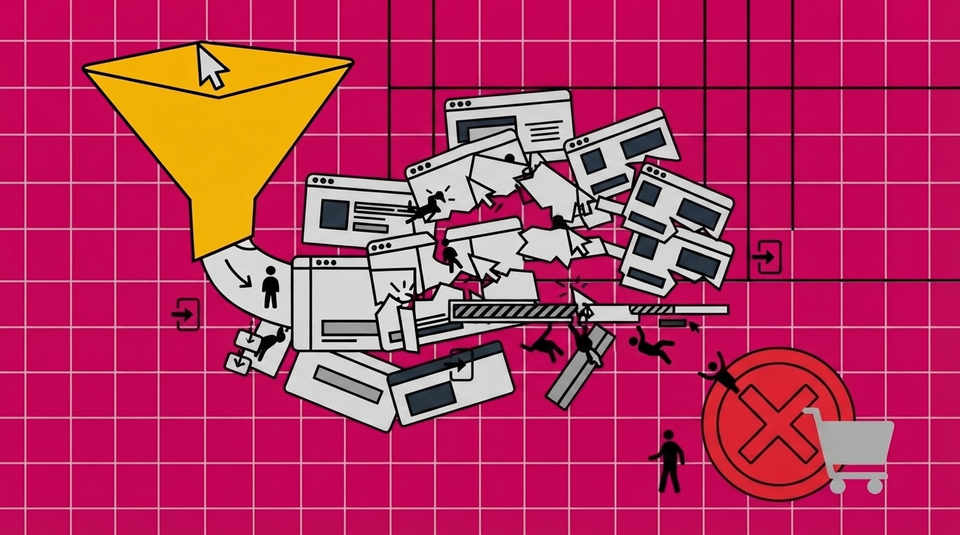
Guessing which of these five is your biggest problem wastes time. A funnel report in Google Analytics — Homepage → Service Page → Contact Form → Submission — shows you exactly where visitors drop off, so you’re not fixing a CTA problem when the real issue is page speed. Heatmap and session-recording tools like Hotjar show what visitors actually do: where they click, how far they scroll, and where they get stuck. Once you can say “we lose 70% of visitors on the pricing page,” you have a specific problem to solve instead of a vague sense that something’s wrong.