CONVERSION-FOCUSED WEBSITE DESIGN: WHY YOUR SITE SHOULD MAKE YOU MONEY, NOT JUST LOOK GOOD
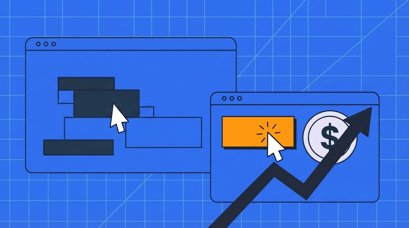
A lot of small business owners judge their website the same way they’d judge a brochure: does it look professional? Is the logo crisp? Do the photos look expensive? Those are fair questions — but they’re the wrong ones to lead with. A website’s job isn’t to look good. It’s to turn a stranger into a lead, a call, or a sale. That distinction is what conversion-focused website design actually means, and it’s the difference between a site that quietly costs you money every month and one that pays for itself.
The Trap of Designing for “Looks Good”
Beautiful Isn’t a Business Goal
“Looks good” is a subjective, unmeasurable target. Nobody can tell you when a site has crossed the finish line of “good enough” aesthetically, because there isn’t one. A conversion goal, on the other hand, is measurable from day one: how many visitors filled out the contact form, requested a quote, or called the number on the page. When “looks good” is the only brief a designer is given, you get a site optimized for a portfolio screenshot, not for your revenue.
Traffic Without Conversion Is Just a Digital Brochure
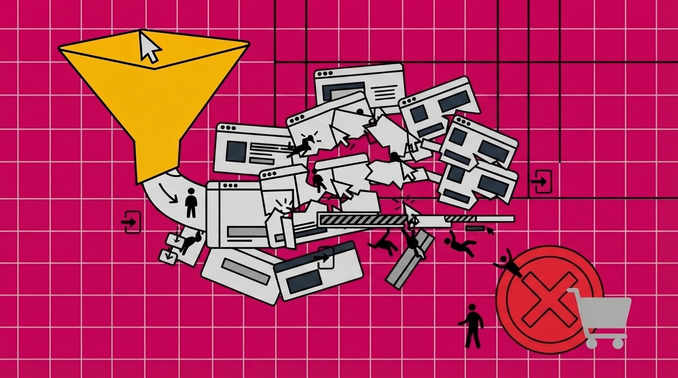
If your site gets visitors but nobody acts, you don’t really have a website in the business sense — you have an expensive, always-on brochure. It doesn’t matter how much traffic your ads or your SEO bring in if that traffic bounces without calling, booking, or buying. That’s the core problem conversion-focused design exists to solve: it treats every visit as an opportunity that should end in a specific next step, not just a page view.
What Conversion-Focused Website Design Actually Means
The Core Definition
Conversion-focused website design (sometimes called conversion-centered design) is the practice of designing every page around a single, specific action you want the visitor to take — filling out a form, calling, requesting a quote, adding to cart — and removing everything that distracts from it. Instead of asking “does this look nice,” the design process asks “does this make it easier for a visitor to take the next step, and harder for them to get confused or leave.”
Why “Looks Good” and “Converts Well” Aren’t the Same Skill
A page can be visually striking and still convert poorly — too many competing calls to action, a headline that doesn’t say what you actually do, a contact form buried three scrolls down. Conversely, a fairly plain page with a clear headline, one obvious next step, and fast load times will often out-convert something flashier. Aesthetics and conversion design overlap, but they’re not the same discipline, and a site built only for the first will underperform on the second.
Why Design Credibility Directly Affects Your Bottom Line
The First-Impression Research
This isn’t just a design opinion — it’s backed by research. The Stanford Web Credibility Project, one of the most cited studies on how people evaluate websites, found that the overwhelming majority of a visitor’s snap judgment about whether a business is credible comes from visual design cues, formed within the first couple of seconds on the page [1]. Before a visitor reads a word of your copy, they’ve already half-decided whether to trust you.
What This Means for a Small Business Website
For a small business competing against bigger, better-funded competitors, this cuts both ways. A cheap-looking or dated site actively undermines credibility before a prospect even considers your price or your service quality. But a site that only invests in “looking premium,” without also being fast, clear, and easy to act on, still leaves money on the table — it earns the trust and then fails to convert it into a lead.
What a Good Website Conversion Rate Actually Looks Like
The 2026 Benchmark Numbers
According to Contentsquare’s 2026 Digital Experience Benchmark Report, which analyzed tens of billions of browsing sessions, the global average website conversion rate across all industries sits at 2.35% — while the top 10% of sites convert at roughly 11.45% [2]. That’s nearly a 5x gap between an average site and a well-optimized one, using the exact same amount of traffic.
How to Calculate Your Own Conversion Rate
The formula is simple: divide the number of conversions (leads, calls, purchases — whatever your goal action is) by the total number of visitors in the same period, then multiply by 100. If your site had 2,000 visitors last month and 30 of them submitted a contact form, that’s a 1.5% conversion rate — below the 2026 average, and a strong signal that design, not traffic volume, is your bottleneck.
The Real Cost of an Unoptimized “Pretty” Website
Wasted Ad Spend
If you’re running paid traffic to a site that isn’t built to convert, you’re not just missing potential leads — you’re actively burning money on every click that lands and leaves. A better-optimized page converts more of the same paid traffic into paying customers, which means every dollar already being spent on ads or SEO goes further without spending a cent more on acquisition.
Wasted Time on Traffic That Never Converts
The same math applies to organic traffic and referrals. Every visitor who leaves without acting is a missed opportunity that took real effort (content, SEO, word of mouth) to earn in the first place. A site that fails to convert isn’t a neutral cost — it’s actively wasting the marketing work that got the visitor there.
Page Speed: The Silent Conversion Killer Behind a Good-Looking Site
The Data on Load Time and Bounce Rate
Google’s own mobile research found that as page load time increases from one to three seconds, the probability of a visitor bouncing rises by 32%; stretch that to five seconds, and bounce probability jumps 90%. More than half of mobile visitors (53%) will abandon a site outright if it takes longer than three seconds to load [3].
Why Heavier “Beautiful” Sites Often Load Slower
Here’s the trap: many of the design choices that make a site look impressive — large hero videos, dense image galleries, heavy animation — are exactly the choices that slow it down. A site can look stunning in a screenshot and still be losing more than half its mobile visitors before the page finishes loading. Speed isn’t a technical afterthought; it’s part of the design decision, not separate from it.
The 5 Elements Every Conversion-Focused Website Needs
Clear, Single-Purpose Calls to Action
Every page should have one primary action it’s pushing toward, made visually obvious through contrast, placement, and copy — not three competing buttons fighting for attention.
Content That Builds Trust, Not Just Fills Space
Testimonials, real client results, and clear explanations of what you do build the confidence a visitor needs before they’ll hand over their contact information or their money.
Structure That Guides the Eye
Visual hierarchy — what’s biggest, boldest, and positioned first — should lead a visitor’s attention toward the action you want them to take, not just toward whatever looks most striking.
Data You Actually Look At
A conversion-focused site is monitored: which pages people leave from, which forms get abandoned, which headlines get read. Without that data, you’re guessing at what to fix.
Traffic That’s Actually Qualified
Even a perfectly converting page underperforms if the visitors arriving were never a good fit for what you sell. Conversion-focused design pairs with targeted marketing, not just any traffic.
Design vs. Platform: Why How You Build the Site Matters as Much as How It Looks
Page Builders: Fast to Launch, Slow to Convert Over Time
Drag-and-drop page builders (Elementor, Divi, and similar plugin-based tools) get a site online quickly and cheaply at first, but they tend to accumulate plugin bloat that slows the site down over time — directly working against the page-speed conversion factors above — and they cap how far the design can go before you outgrow the platform.
Fully Custom Code: Converts Well, Costs and Waits a Lot
A website hand-coded from scratch by a traditional dev agency can be built exactly around conversion goals with no plugin bloat, but it’s typically slower and more expensive to build, and the client usually can’t make routine content updates without going back to a developer — which quietly discourages the ongoing testing and tweaking that conversion-focused design depends on.
Custom WordPress: The Middle Path
Custom-coded WordPress development sits between those two extremes: a site built by developers around your specific conversion goals — not assembled from a page-builder template — but running on WordPress, so it stays fast to build and load, and you can still edit and test it yourself after launch without paying a developer for every small change. That combination matters specifically because conversion-focused design isn’t a one-time build; it’s an ongoing process of testing headlines, forms, and calls to action, and a site you can’t touch yourself is a site that stops improving the day it launches.
How to Tell If Your Current Website Is Losing You Money
Red Flags to Check This Week
A few quick signals worth checking: does your site take more than 3 seconds to load on mobile? Is there more than one competing call to action above the fold? Is your conversion rate (using the formula above) below the 2.35% industry average? Would a first-time visitor know exactly what to do within 5 seconds of landing? If any of these are a “no,” your site’s design is likely costing you more than it’s earning.